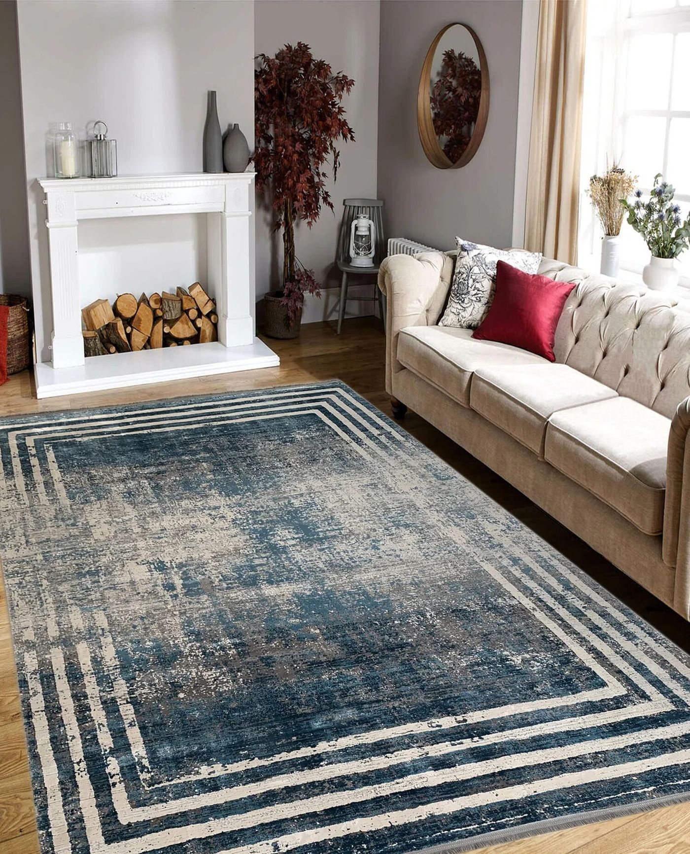
A small living room can already contain several patterns before anyone decides to decorate it: a rug, a woven chair, books, curtain stripes, and the grain of the furniture. Adding another print is easier when you first understand those existing relationships. Otherwise, a new cushion can become the start of an unnecessary replacement chain.
Etsy’s October 14, 2026 report describes a more expressive seasonal direction, while Houzz’s Fall 2026 report discusses personal, layered interiors. Here, layering is a practical composition exercise using one existing patterned piece. It is not a rule that a small room needs maximalism, new furniture, or a particular number of prints.
Choose the pattern that already earns its place
Start with a piece you actually want to keep in the room. That might be the rug that fits the furniture, curtains that provide needed privacy, or an inherited chair you use every day. Do not select an anchor solely because a photograph calls it fashionable while ignoring its condition, care, or practical role.
Look at the piece from the ordinary entrance and the main seat. Note its dominant colors, the size of its motif, and how busy it appears at those distances. A pattern that looks detailed in a close-up can read almost as a solid surface across the room; another can remain visually prominent from the hallway.
Write a short description using ordinary words, such as “dark blue rug with small cream repeats.” That description helps compare candidates without pretending the room needs a formal design classification. The coffee-table and ottoman comparison is useful before changing furniture just to make a pattern scheme work: the room still needs to support its daily activities.
Separate motif size from visual density
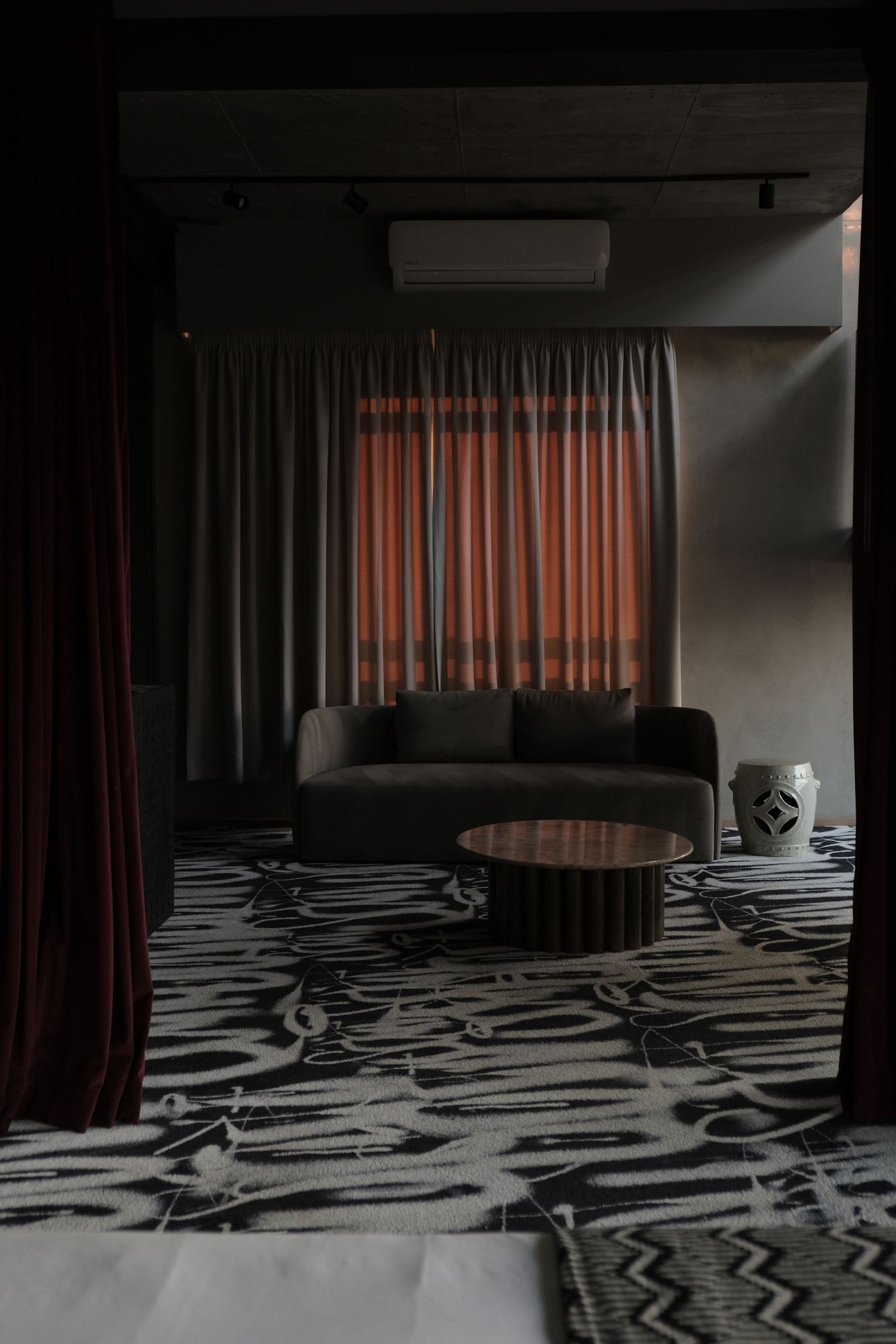
A large motif is not necessarily louder than a tiny repeat. Strong contrast, close spacing, and the amount of visible patterned area also affect what catches attention. Compare the anchor as it appears in the room instead of relying on a product label such as “subtle,” “bold,” or “small-scale.”
For a first companion, try changing one clear characteristic. A loose broad stripe can create a different rhythm beside a dense floral, for example, while two equally dense small prints may compete. These are starting hypotheses to test in your room, not universal restrictions on which patterns may coexist.
Include texture in the comparison. A heavily raised weave can attract attention even without multiple colors. Conversely, a printed textile with a soft contrast may feel quieter than its intricate motif suggests. Place the actual available pieces near one another before deciding that a pattern mismatch requires a purchase.
Keep one simple connection between pieces
Choose a relationship you can explain without a complete matching set. A companion might repeat one color from the anchor, echo a curved shape, or use a similar background tone. It does not need to reproduce every element, and the relationship does not have to be obvious in every light.
Use actual samples or existing pieces where possible. A phone image is useful for remembering an idea but cannot establish exact color, texture, or scale. If you are considering a purchase, review the dimensions and return terms and inspect a suitable sample when available rather than treating a cropped listing photo as proof of a match.
Limit the first experiment to one companion. Move a patterned cushion from another room or try a textile you already own without changing the anchor. A single reversible test makes it easier to understand the result than adding a rug, curtains, artwork, and several cushions at the same time.
Decide where the room can stay quiet
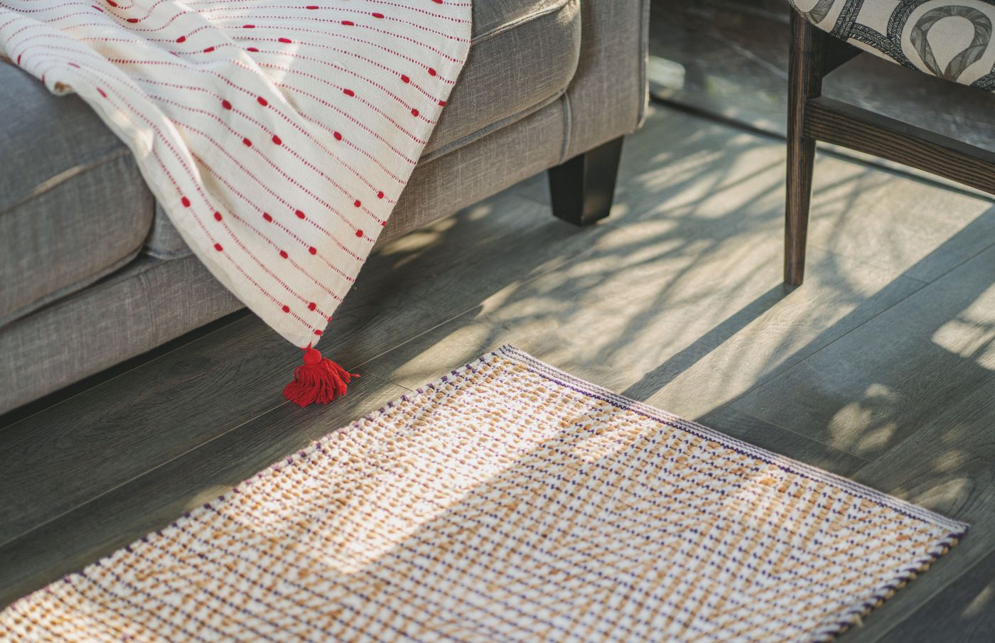
Leave useful areas where the eye can rest if the arrangement feels busy. A plain sofa section, unpatterned curtain panel, or clear patch of wall can separate stronger elements. Quiet space does not have to mean beige, and it does not require removing every object that makes the room personal.
Consider the entire view rather than a styled corner. A patterned rug may sit beneath a clear table, but its visible relationship with a patterned chair can change when someone is seated. Check the view from the places people actually use, including a low seat or an adjacent dining area where relevant.
Do not sacrifice practical open floor to create a photogenic layer. The guide to reserving working floor space addresses a different task, but it reinforces the value of usable room capacity. A decorative stool or extra rug should not make an ordinary route or furniture operation awkward simply because it completes a composition.
Test area, not only the number of patterns
One large patterned curtain can affect the room more than three small cushions. Before adding another motif, estimate how much of the ordinary view it will occupy. If the anchor already covers the floor, a small companion may provide enough repetition without introducing another dominant surface.
Try removing one optional item before deciding the scheme needs something new. If the arrangement becomes clearer, the issue may be the amount of competing area rather than an incorrect color combination. Keep removed items together temporarily so the experiment remains reversible and does not create scattered storage around the home.
Check the room in its ordinary daytime and evening lighting. This is an observation of your own setting, not a claim about measurable color accuracy. If a combination only works in a tightly cropped photograph, decide whether that photograph represents the room you want to live in.
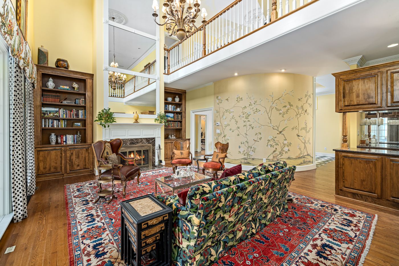
Protect the functions that textiles already serve
Curtains may need to provide privacy, a rug may need suitable placement on the floor, and a throw may be something someone actually uses. Keep those roles in the decision. Replacing a functional piece with a visually coordinated one can create a new care or fit problem that the color discussion overlooked.
Avoid making every soft surface decorative-only. Check that people can sit comfortably and that cushions have an appropriate place during use. If the companion print creates a daily pile on the floor, try a different format or a smaller change instead of adding a storage basket solely to support the styling.
Review textile care before swapping items between rooms. Our removable cushion-cover care guide explains why a zipper does not establish washability. Likewise, an existing textile should not be assumed suitable for a new job just because its print works with the anchor. Keep the practical decision connected to the visual one.
Make a photograph that helps you decide
Take a normal wide view from a repeatable position, with household permission where needed and private details excluded. Use it to compare the anchor alone and the anchor with one companion. Keep the camera position similar so a change in crop does not masquerade as a better arrangement.
Ask a concrete question when reviewing the images: can you still see the anchor clearly, does the companion establish a useful relationship, and are the daily routes and seating intact? “Does it look trendy?” is less helpful because the answer can encourage another purchase without identifying what the room needs.
If the experiment works, stop there for a while. If it does not, restore the previous arrangement and change one variable on another day. You can keep a brief note about the rejected scale or contrast without maintaining a large folder of nearly identical shopping screenshots.

Set a buying boundary before extending the scheme
Choose a specific unresolved need before browsing. That might be one usable cushion cover in a compatible size, rather than “more pattern.” Check the full dimensions, material, care, and purchase terms. Keep the anchor’s description nearby so a promotional photograph does not quietly redirect the room around a different palette.
For any furniture purchase, the delivery-route guide covers a separate constraint that a beautiful pattern cannot resolve. For textile changes, the same practical attitude applies at a smaller scale: the item must fit its real job. A layered room can remain modest, familiar, and unfinished in a comfortable way when each addition has a reason to stay.
Explore related decisions in our Small-Space Living hub.
Sources and editorial scope
Editorial research checked October 20, 2026. Published trend reports are context for these editorial applications, not verified live keyword rankings. Practical household guidance; photographs do not document a tested household or authenticate pictured materials.