
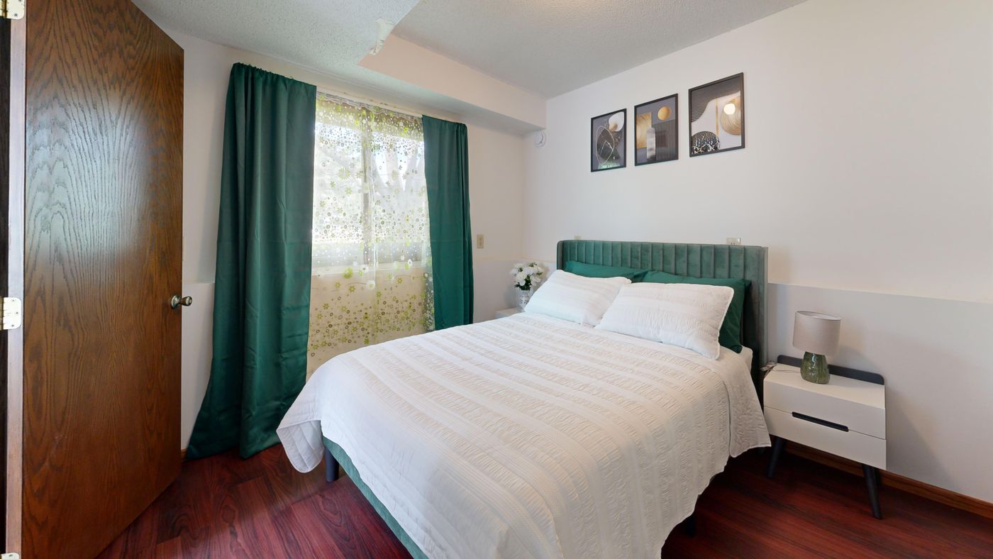
A bedroom does not need replacement furniture to gain a more coherent color palette. Often the useful first decision is choosing which existing color to repeat and which object should carry that repetition. A small room can make an accent feel more prominent, so a limited trial is more informative than ordering several coordinating items at once.
Houzz’s Fall 2026 report describes warm wood, earthy color, and layered personal interiors. Those directions can inform a bedroom refresh, but they do not prescribe one correct shade for your home. This guide is a method for comparing what is already present and testing a movable accent. It makes no claim that a particular color improves sleep or changes the room’s physical size.
Separate fixed finishes from movable objects
Start with the elements that are unlikely to change for this refresh: flooring, a large wardrobe, the bed frame, existing upholstery, and any finish you are not permitted or planning to alter. Observe their colors under the room’s ordinary light rather than assigning them all the convenient label neutral.
Wood can contain several visible tones. A pale wall can look different beside a cream textile than beside a bright white one. You do not need to identify a technical color formula; a plain description such as warm brown, cool gray, or yellowed cream is enough to begin comparing relationships.
Then list the objects you can move or change without creating another project. Existing bedding, a suitable cushion cover, an artwork already owned, or a small accessory may provide the trial. Keep useful furniture out of the replacement discussion until you know whether the problem is really its color rather than its position, condition, or function.

Identify the color already doing the most work
Look at the room from its usual entry point and from beside the bed. Notice the largest areas of color and where your attention goes first. A patterned duvet can contribute several colors, but its strongest visible impression may be different from the tiny accent you notice when inspecting the fabric closely.
Choose whether your proposed accent will repeat an existing secondary color or introduce a new relationship. Repeating a color can connect objects that currently feel unrelated. Introducing a different color may be appealing, but it deserves a smaller trial because it adds another element to the room’s visual vocabulary.
Do not treat every object as equally influential. A large upholstered headboard occupies more of the view than a small vase. An accent that seems subtle as a cushion may feel dominant as a full curtain. The scale of the colored area belongs in the decision alongside the shade itself.
Write one clear intention
Describe the intended change in ordinary language: “Connect the green in the print with the bedding,” or “Add one warmer textile beside the gray bed.” That statement gives the trial a purpose. “Make it look like the photograph” is harder to evaluate because the photograph may show different light, proportions, finishes, and furniture.
Include the practical boundary. You may be keeping the current duvet, avoiding wall changes in a rental, or using only objects already owned. A clear limit is useful; it prevents a small accent decision from expanding into a new bed, curtains, rug, and lighting plan before the first comparison is made.
If the bedroom is shared, include each person’s preferences and the areas they use. Creating useful boundaries in a shared bedroom addresses that broader balance. A color trial should support the whole occupied room while leaving personal space and existing agreements understandable.
Compare candidates at a realistic size
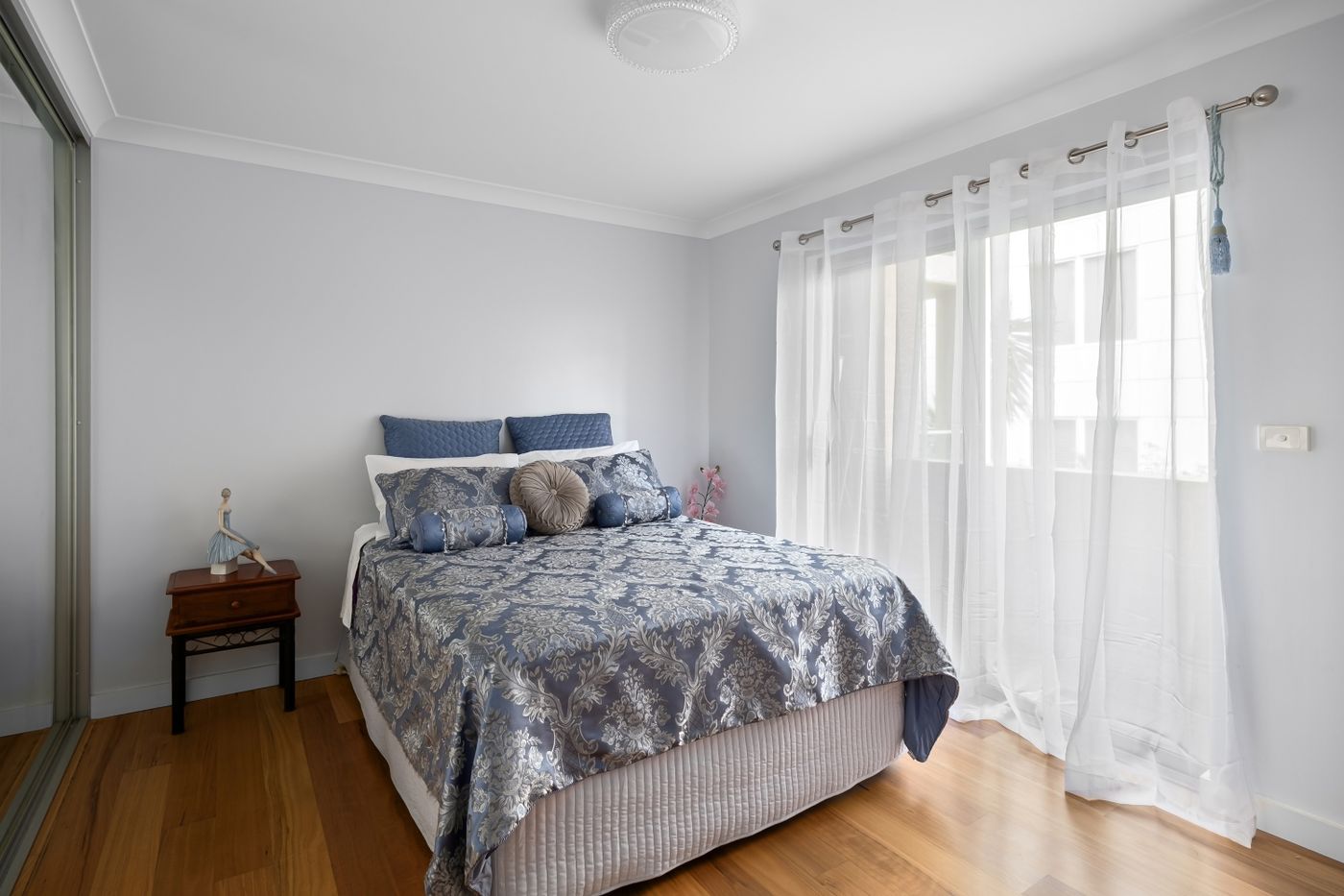
Bring one or two existing suitable objects into the room and compare them separately. Keep their actual role in mind. Holding a tiny corner of fabric against the wardrobe can help you notice a relationship, but it does not predict how a full bedspread of that color will look.
Where you are considering a purchase, obtain an appropriate sample or inspect the material through the available legitimate route before committing when the color match matters. Screen images and product names are imperfect substitutes for seeing the actual material in your room. Do not interpret a supplier’s word sage, rust, or cream as a universal color specification.
Use the sample only as its owner and material allow. Do not attach it to a wall, furniture finish, or borrowed object with an unverified adhesive. A clean support or suitable temporary placement may be enough for comparison. The test should remain reversible without leaving another repair task behind.
Change one visible element at a time
Place the trial accent in the role it would actually fill, then live with the arrangement through the room’s normal activities. Keep the rest of the palette reasonably constant so you can see what that one change contributes. If you move four colored objects at once, it becomes difficult to tell which adjustment helped.
For example, a green cushion cover might echo a print while leaving the main bedding unchanged. If that works, the next question is whether another repetition is needed at all. A successful first accent does not create an obligation to buy matching curtains or replace a functional chair.
Also test the absence of an object. Removing an unused busy accessory can make an existing color relationship clearer without adding anything. Keep other household members’ preferences and ownership in the conversation before taking their possessions out of the room or moving a shared object elsewhere.

Judge the result in the light you actually use
Observe the trial in daytime and during the evening routine, with the lights and window coverings normally used. Notice whether the color still feels appropriate beside the fixed finishes. A shade that looks close to an artwork at noon may appear quite different under the bedroom lamp.
You do not need to measure that difference professionally for an ordinary decorating choice. Decide whether you like the real combination at the times that matter. If an exact match is essential, use an appropriate professional or supplier comparison process instead of assuming a phone photograph can settle it.
Do not move curtains or furniture into impractical positions to reproduce a temporary lighting effect. Checking the bedroom door swing helps preserve actual room access, while keeping the nightstand functional protects the small surfaces people need every day. A color decision should remain compatible with those ordinary actions.
Consider texture, pattern, and maintenance together
Two objects in similar colors can feel different because one is shiny, another heavily textured, and another covered in a strong pattern. Compare the complete material rather than asking only whether its color matches. An understated color in a large patterned area can be more noticeable than a brighter color on a small plain object.
Check whether the proposed textile or accessory suits its intended use and can be cared for as required. A beautiful item that needs an impractical return or cleaning routine may not improve the room. Keep the maker’s actual care requirements separate from styling descriptions such as relaxed, cozy, or natural.
If an accent occupies a usable surface, account for what moves. Assessing a lap desk in a small bedroom illustrates a different object with a real working footprint. Decorative additions also need a place that does not remove the only convenient area for a book, glasses, or a necessary everyday item.

Use a simple keep, adjust, or return decision
After a realistic trial, compare the result with the intention you wrote at the start. Does the accent connect the objects you wanted to connect? Does it still work under normal light? Is it comfortable for everyone sharing the room, and does the object fit the household routine?
Keep the choice if it does that job without further purchases being necessary. Adjust the position or scale if the relationship is promising but too dominant or too hard to notice. Return the borrowed trial object or use the seller’s applicable return process when the actual purchased item does not suit the room, keeping the relevant terms in mind before ordering.
Avoid describing a failed trial as wasted effort. It can establish that a different shade, material, or smaller area is the better direction. Record that finding briefly so the next decision does not begin from the same uncertainty.
Let the palette remain personal
A bedroom can contain more than one wood tone or a collection of textiles acquired over time. Coherence does not require every object to come from a single matching range. The useful question is whether the relationships feel intentional to the people who use the room and whether the room still supports their daily needs.
Keep the accents that earn their place through appearance and use. Let the rest of the room evolve when there is a real reason to change it. A clear color intention, one modest trial, and an honest decision can deliver a meaningful refresh while leaving useful furniture exactly where it belongs.
Explore related household decisions in our Small-Space Living hub.
Sources and editorial scope
Editorial research checked October 17, 2026. Trend-report dates and limitations are stated in the article; these are editorial applications of published signals, not verified October keyword rankings. Practical household guidance; illustrations do not document a tested household or authenticate a pictured material.
